

.svg)

.jpeg)
Shaping our new brand direction
It’s been over 2 years since our brand look and feel was given an overhaul by Ueno. That project, as a whole, was a huge success. It leveled us up and gave us an identity, made us feel like a grown-up company with responsibilities and a mortgage. But, as is always true in life, things get older, thing change. That's a good thing! And although we felt the branding project suited us very well at the time, we felt it didn't reflect where we are now or where we're going.
But "Why?!?" You shout. "Why does it not reflect who you are as a company now?1?" Also, maybe keep it down so you don't annoy your neighbors.
Well, let's break down some of the rationale behind why we felt it was time to move forward.

If you look at our brand values, you might quickly see where a divide might begin and why we felt our previous approach (which is still current on many of our pages) was becoming disjointed.

On top of our brand values, we have our Brand Essence. This is the linchpin, the lifeblood that runs through our what makes us who we are:
We are Joyful🎉:With our product, we strive to make both our customers’ processes and work more enjoyable. Our designs, our illustrations, and our words should reflect the joy behind that goal.
We felt it was critical that as we grow our brand assets better align to our brand values. Looking at them, there was a mismatch. Our colors are bright, really really bright. Not simple, not focused, and arguably distracting. Our illustrations were too generic. They weren’t really that helpful, they didn't stand out, and really didn’t offer much value.
We felt we were missing something that plenty of other brands also overlook: a solid visual hook. A metaphor that ties everything together. I’ll get into that in a bit, but for now, let’s focus the core elements we wanted to change, why we wanted a refresh, and how we went about changing them.
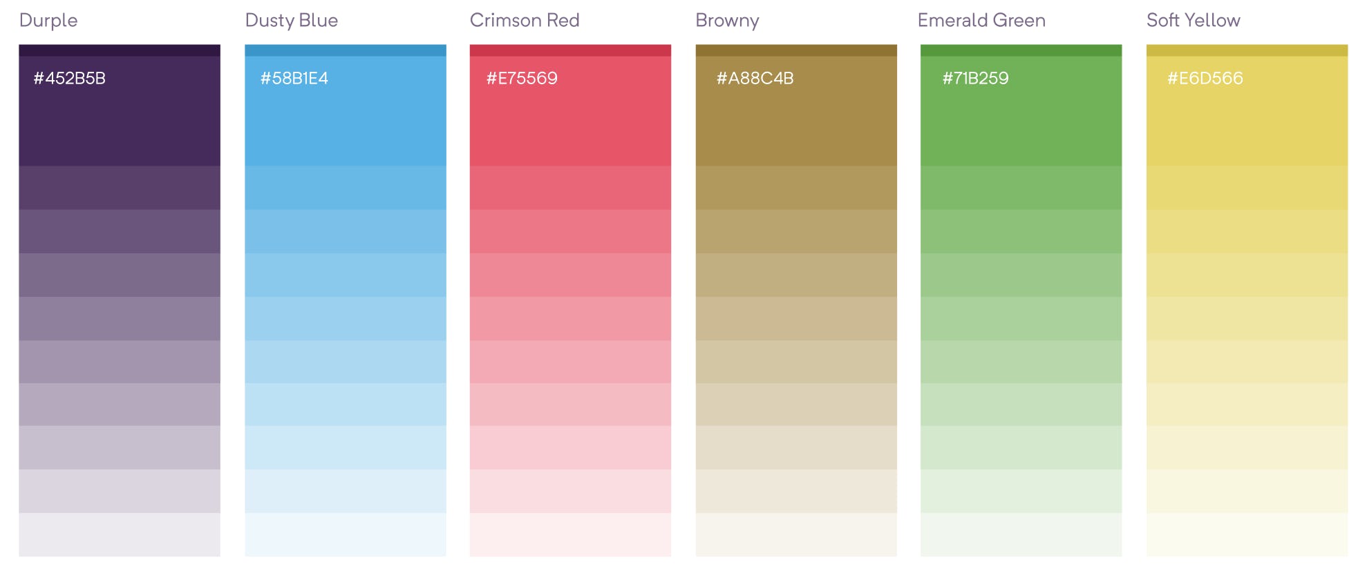
Our Color Palette 🎨
Let’s have a look at the colors. As mentioned, our color palette was something that was really important to our visual identity. The chosen palette was powerful, but too powerful. The main primary color was a really bright purple, or blurple as Ueno named it. Our entire identity hinged on this somewhat ridiculous sounding variation of purple: blurple. We had other bright colors too, a bright red, a bright orange, a bright green. The problem was, all the colors were so bright, they constantly fought against each other.
The thing about choosing a color palette is, it’s just so damn subjective. And I include our thoughts about the bright colors in that assessment. Like anything in design, some will love it, some will hate it. We needed something that was simple, friendly, joyful, and more importantly, functional. Something that we felt comfortable using consistently.
We set out doing some competitor analysis, looking into how other SaaS companies applied their colors. It’s all well and good picking a set of colors. What is important is how they’re applied. How much weight each color gets and how the balance of the colors work together.

We felt a sensible direction would be to choose a set of colors that were somewhat approachable. We also wanted to try keep purple, so we changed our ‘blurple’ to a ‘durple’ (or dark purple) which also allowed us to continue our tradition of making up names for shades of purple. Then a green, a red, a blue, a yellow. Nothing overly aggressive, something friendly.
The next part of the process was tedious. A lot of finger in the air choosing of colors, ‘this, this, this, maybe this, 🤷♂️ let's just try it and see’. There are a lot of colors to be found in this universe. We then created a small abstract illustration that would help us apply colors to it to see how they all felt together.

We chipped away, over and over, whittling down, until we got somewhere that we were happy with. When we had a pretty good idea of a palette we felt might work, it was time to apply the colors to real world assets. Again, a collection of concept assets were created to try things out. Social assets, illustrations, iconography; just random designs that we thought would help us figure out what worked and what didn’t.

Actually, I’ll share the link of the Figma file, as it will give you a better idea of the process. Here you go.
Anyway, long story short, eventually, after a lot of minor tweaking, addressing accessibility issues, ensuring colors worked in harmony, we got to a stage where we were happy with our refreshing array of pretty colors with a plan to heavily lean on the opacities of each color to apply a light, smooth, fluffy approach.
Our Illustration Style 👨🎨
At the same time we were revamping our colors, we were doing the same with our illustration style. As we felt it was important to be able to test colors with the illustrations, it was key that they were developed hand in hand.
The aim was to have something that aligned to our brand values. It had to be fun. Unique. Or at least unique enough to have a hook.
I tried out multiple styles to begin with. Some worked, some didn’t. You can see the some examples of different directions here:

Some of these were decent, but I think the blocker was the color palette. We hadn’t really nailed down a new palette so some were still using the blurple which ruined the balance.
We chipped away on the styles, over and over, until we got somewhere that we felt was moving in the right direction. A more sketchy style seemed to fit our brand, it added the right personality, it felt more ‘hands-on’.
Once we agreed that a sketchy style was the best approach, there was a lot of back and forth working on stroke usage, stoke color, stroke weight, shading, to get to a stage where we felt things felt right. We were making good progress at this stage with our color palette so it allowed us to make some more definite decisions. I’ll try break down the overall style approach that we settled on:
- Strokes: use the primary color only (The Peppa Pig method)
- Fills: use opacities only, so no element is usually too glaringly overpowering
- Shading: uses a lined effect to show depth.
- Overall Style: each concept is drawn properly, nothing is skewed or ‘wonky’.
- Overall Concept: each concept is pretty light hearted and fun, try not do anything too generic.

Our Mascot Redesign 🥳
I’ll touch on this project as it’s important to the bigger picture. Originally, Ueno developed Dot, our little purple character. It was to be used to add some fun and joy, but the problem was we had no real idea of how to use it. It popped up in random places, for no real reason, then vanished. For a while we gave it arms and legs to make it easier to dress it up like a kind of knockoff Octocat. It was clear that Dot needed to evolve too.

Our Creative Director wrote a whole backstory for Dot, creating a new set of friends in the process. A whimsical tale of a gang of shapes who lived together in harmony in a magical shape filled world. Except for Stomper; Stomper is kind of a jerk…

Our Visual Hook 🎣
This is when things took a twist. So, usually for me these projects are relatively straight forward. You create a new color palette, a new illustration style, then apply it to the marketing website and whammo, that’s it. But this is the part where I feel I have learned the most from this project.
The project always felt like it was missing something. Yea, we had a cool new color palette, a cool new illustration style. But the big question that kept tickling the back of my mind was ‘What exactly are the illustrations going to be, what’s the catch, how does it all sync up with the product?’ We didn't just want to throw our mascot up everywhere.

We needed a story. A memorable, unique story. Something that aligned with our values, used our new brand style and most importantly made sense when sitting alongside our content. We thought about Project Management, ‘What does our product do. It brings people on a journey of product development. We could do characters going on a journey, venturing through forests, climbing huge mountains?’ Nah, too obvious…’Well, we help people build products. We could do a construction theme, we could have little minion builders hanging out of big monitors and cards?’ Nah, it’s been done before…
So we started thinking about Dot, and the gang. The shapes. Tetris. How, if all shapes work together they build structures. What if each shape symbolized a task within your project. Not all projects are perfect, but if you’re careful, and have an amazing project management tool to help you, you’ll create some amazing, beautiful structures. So we started to explore shapes, sitting on top of shapes, gently balancing.

And then maybe to add a little more joy, what if the shapes were alive, subtly watching you…

For such a random, quirky concept, it all just seemed to make sense. Things all seemed to just fall into place. The colors, the illustration style, Dot and the gang, all working towards this higher concept. It felt scalable. In its most basic terms, you have the shapes, all working alongside each other to build structures, They’re the spine of our illustration style across our marketing site. Then as you dig deeper into the brand, you start spotting Dot and the gang, more defined characters, with their own personalities, being used for social assets, for marketing collateral, blog illustrations, for swag. We’ve already kicked off cool swag from shapes stickers, to a coloring books. Dot stress balls, cool colorful socks full of shapes with shifty eyes. The possibilities are endless.
At last we have a solid visual hook that we can stand by and really push. A visual identity that can become our personality, something we can own. Already we’re seeing the advantages of the visual hook. We can’t wait to really push it and see how far we can take it.

And thats a wrap✌️
A little dive into our new brand approach. Obviously this is just the start of things. We’ve a huge evolving project in front of us but we can’t wait. We firmly believe in this new direction. I hope you do to. If you have any questions regarding any of the above, feel free to shout out.
To see our in-progress rebrand in action, keep an eye on this very website. Alternatively, feel free to give Al a shout to pick his brain (or whats left of it) over at: