

.svg)

Building Dark Mode into a complex web app

Why did we build Dark Mode into Shortcut?
People have been talking about Dark Mode for years (see this Gitlab issue for the drama likely playing out across every PM tool), but it feels like we’ve finally hit critical mass. We’ve seen a broad industry shift and adoption of Dark Mode — across operating systems, editors, terminals. Dark Mode can save battery life in OLED displays. Some of our customers put Shortcut up on a large display to facilitate stand-ups or iteration planning meetings, or to track progress throughout the day, and a large display can be blinding.
There are accessibility reasons. We’re building a tool that our users look at for extended periods of time, and that can cause migraines and eyestrain. Legally blind customers have reported that light text on a dark background is easier for them to see. And as anyone who has worked late at night can tell you, Dark Mode is much easier to look at in low light conditions.
Ultimately, we’ve designed Shortcut to fit in seamlessly with the toolset of the modern software team, and Dark Mode is a part of that product vision. We also wanted to try to be the first Project Management tool on the market to offer Dark Mode support.
Read on to find out how we did it.
Challenges
Turns out there was a reason nobody else had Dark Mode yet. The level of effort is extremely high. Modern Project Management apps are incredibly complicated under the hood. Regardless of how you prioritize your work, it’s hard to justify the work against everything else on your product roadmap. But we agreed as a team that it was worth pushing ourselves to get it done.
The first challenge we faced was that our web app wasn’t built with multiple themes in mind. Our color palette and design system was custom-built over the course of 5 years. We had technical debt to clean up to even get to a point where we could start building themes.
Secondly, we didn’t want a second mode to slow us down as we design, develop and QA new features. This would’ve happened if we went the quick-and-dirty route of adding a bunch of !important CSS overrides, which some of our customers have tried, using browser extensions and user-defined stylesheets. Anyone could take a couple hours to get one page sort of looking right using dozens of CSS overrides. The thing is, our web app is made up of dozens of pages and dialogs, and hundreds of UI components and elements, each with different states (alert, error, success) that you don’t normally see. All of those needed to be catalogued and refactored by hand. What seemed to the casual observer like a day of work in reality took a team several weeks.
We also wanted to get to a place where we could add additional themes easily (e.g. a high-contrast theme). So this dovetailed nicely with a large-scale Design System initiative that our Design team is working on.
Our Process
We started by designing several Dark Mode variations in Figma, our design tool of choice (a Dark Mode in Figma would’ve been useful ;)). This early round of mockups made it clear that a Dark Mode version of our existing visual design could not only look good, we could use this as an opportunity to make a couple subtle improvements to our visual design while we were at it.
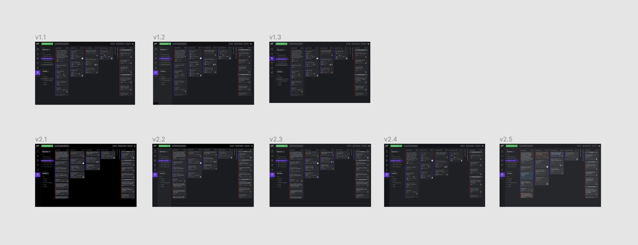
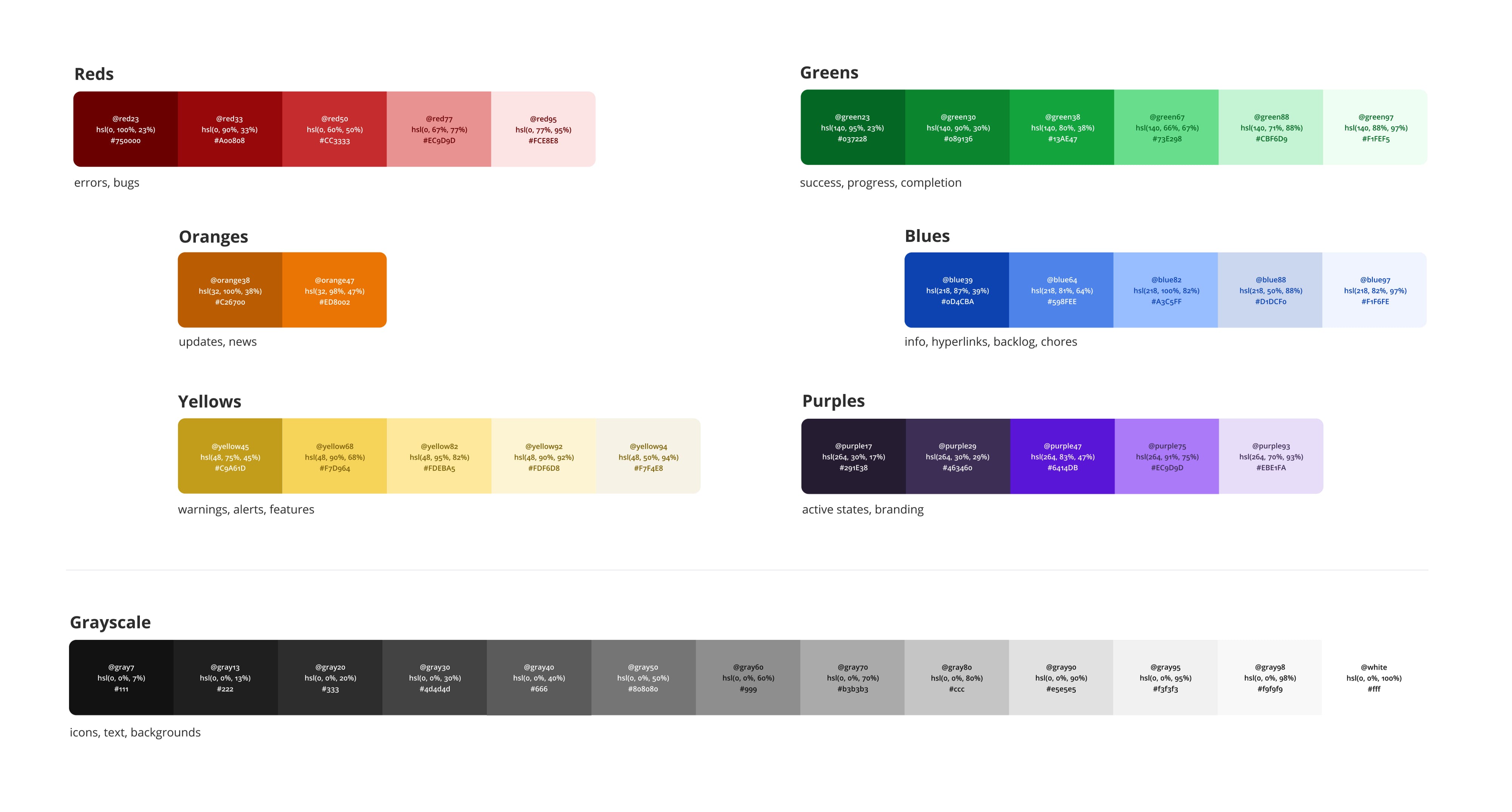
We wrote a tool to extract every color value in our web app’s codebase and present them in a grid on a single page, sorted by hue and lightness. What we found was a little scary. Our web app was using 451 colors in total, in thousands of different locations.
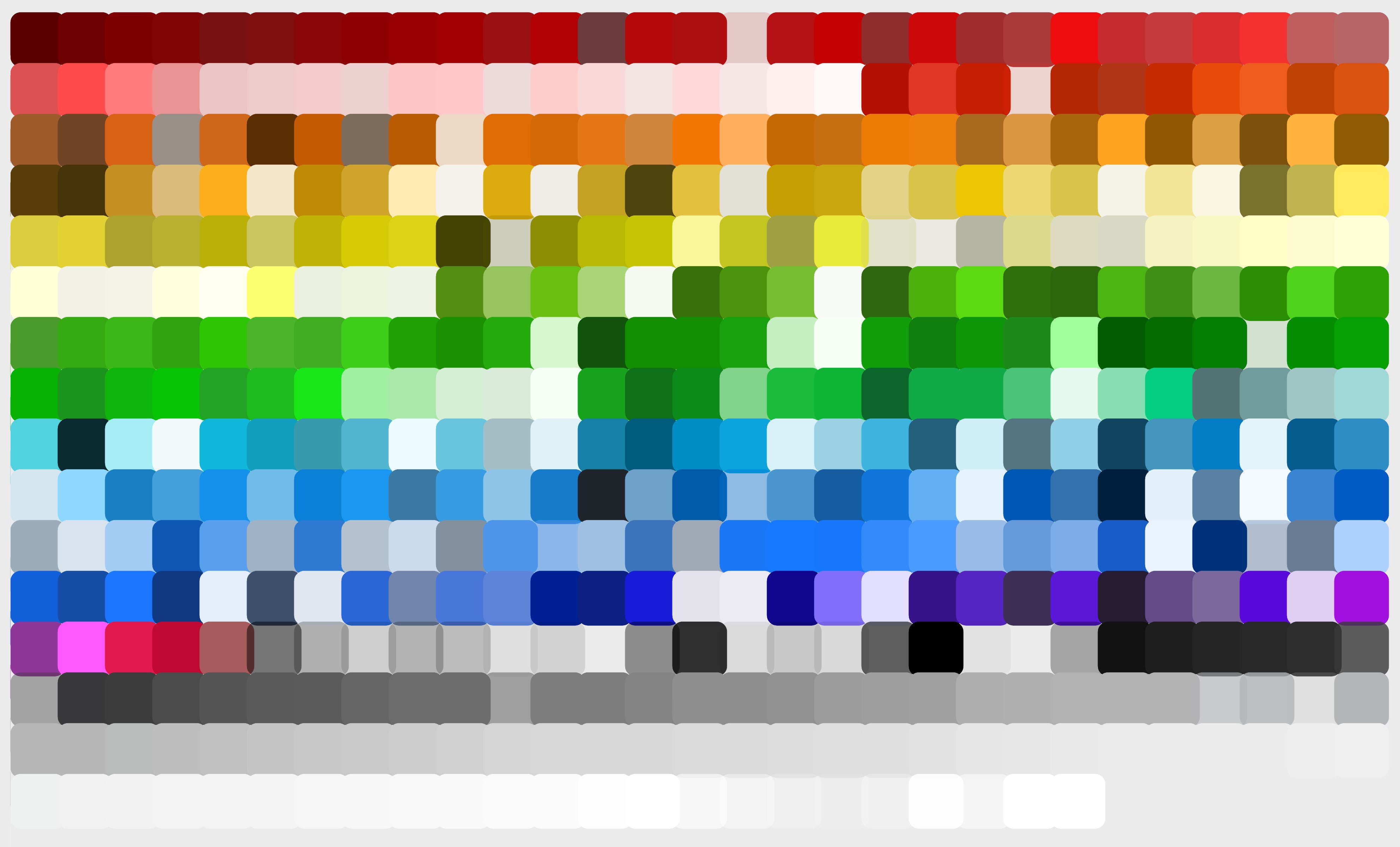
We discovered that it’s hard to sort colors in a way that places visually similar colors together. It’s also hard to combine visually similar colors programmatically. Two adjacent colors in the RGB color space might look identical or totally different, depending on where they are. So we ended up adding some drag-and-drop functionality to our tool to make it easier to combine visually similar colors by hand.
The drag-and-drop feature generated some code to feed back into the script, which would then find and replace the colors in the codebase. We repeated this subtractive process over and over again, performing regular visual regression testing as we went, until eventually we had reduced our color palette down to 52 colors in total, and 6 specific hues, each with roughly 5 variations in lightness.
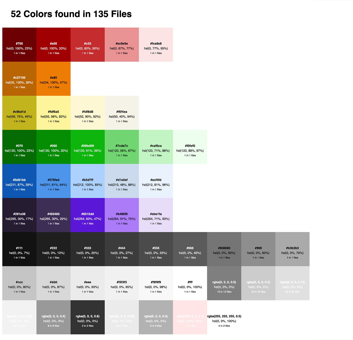
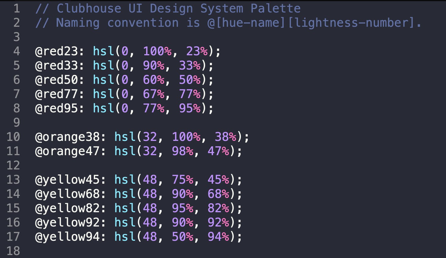
At the same time, we replaced all of our hex color values with hsl. This made fine-tuning the palette incredibly easy, especially since we had a lot of subtle hue variation that wasn’t obvious until we saw it in hsl (you can see them in the screenshot above if you look closely).
We deployed the color refactoring work before moving on to Dark Mode. One person did notice that our paragraph text became a little too light in our Slack community (fixed, thanks Regan!). Otherwise, not a single person noticed that we quietly changed every single color in the app overnight, and that we went from 450 colors down to 50. We consider that a success all of its own.
Once we had a color palette and those represented as LESS variables, we were ready to start the long, tedious process of applying them as semantic variables across the app. This means we ended up with canonical variable names for app-wide borders, icons, buttons, backgrounds, text, as well as page-specific components and elements.
Each theme became a list of semantic CSS variables, which was the easiest in terms of implementation and build process. It meant that, instead of building our app CSS once per theme, and making a new HTTP request whenever the theme was toggled, we could just update the data-theme attribute on the html element, and it would instantly update. It also meant we could add a buttery-smooth fade animation when toggling between modes using CSS transitions.
There wasn’t anything particularly interesting about this part of the process — it was a lot of manual refactoring and pruning of one-off elements that should’ve been using a common component.
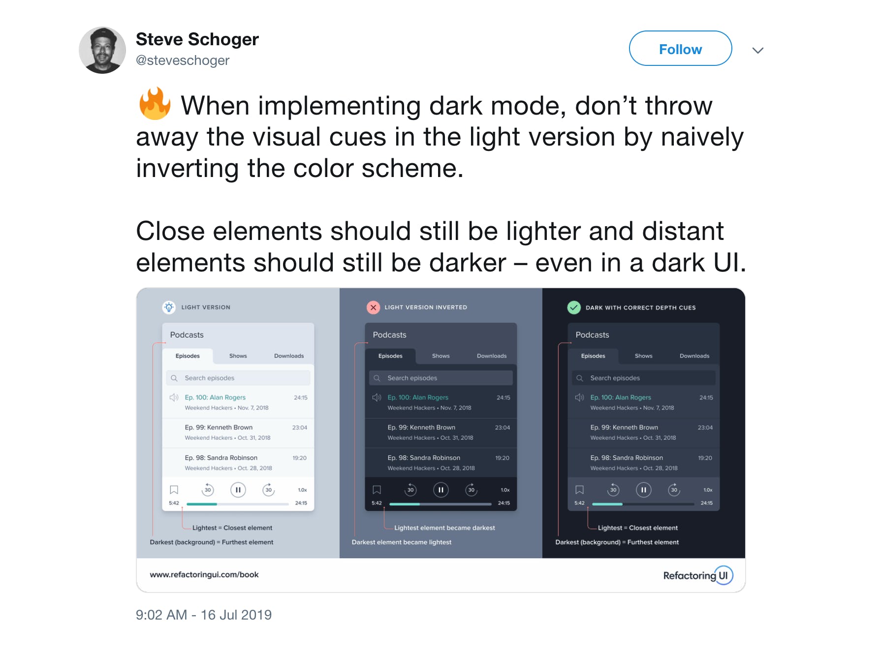
One bump in the road was how to deal with images and SVG-based spot illustrations, but we ended up being able to invert them using CSS and it worked out. Otherwise, the design of Dark Mode had less to do with inverting color and more about making it appear as if the lights had gone out, and the text was glowing, like a city skyline at night.
Finally, we got to the point where we could use it internally, and the whole team here helped in the QA process, as literally every page, component, and application state needed to be manually verified.
Obviously, we used Shortcut to track and fix the bugs found, and our Product, Design, Engineering, Marketing and CX teams were able to coordinate together on the feature release, which went off without a hitch.
Outcome & Next Steps
Since its launch two weeks ago, we’ve seen a healthy adoption of Dark Mode. Even though it was just released, 14% of all active users already have it enabled. And 2 out of every 3 users that have tried out Dark Mode still have it enabled.
User feedback has been positive overall. One point that we’re still on the fence about is the decision to remove the different background colors that denote story types. This was a design trade-off between providing more information at a glance vs. providing a clean, elegant UI that isn’t visually overwhelming, especially for new users. Whatever your opinion, please let us know — your feedback really does impact how we think about the product.
In terms of next steps, the Design team at Shortcut is working on building a Design System, starting in Figma. As we refactor our web app architecture using React (more on that in another post, coming soon), we’re looking into re-implementing and documenting our components using a tool like Storybook so we can build and test features faster, in isolation.
We hope you enjoy Shortcut Dark Mode, and we hope this article provides some useful context for how you might go about building Dark Mode in your own web app.